
Feet First
Website Redesign
Project Overview
Brief
Feet First is a nonprofit organization advocating for pedestrian safety throughout Washington State. My team and I redesigned their website to increase site traffic and encourage donations and volunteering.
Tools
Figma
Mural
Trello
Zoom Meetings
Google Hangouts
Loom
Otter.ai
Optimal Sort
My Role
UX Design Lead
I served as the main contact with the organization's Board, facilitated team meetings, and managed schedule and task assignments.
I also led user research and data analysis.
Team
Mary Jane Alioto Design System Lead and Research
Alyssa Yeoman Product Design and Information Architecture
Amanda Correa Interaction Design
Alex Reed Visual Design
The Problem
Feet First's website was full of outdated programs and features, cluttering the content and creating a hard-to-navigate experience. It lacked direction and was in need of a clear donation pathway.

Site homepage before our project
The Solution
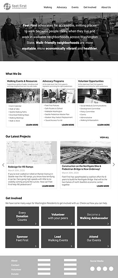
We designed a functional, sustainable site that introduced the organization with confidence and provided clear pathways for users to get informed and get involved.

Our re-design of the site's homepage
Goals
1 Improve and modernize user interface to create intriguing environment and lengthen site visits.
2 Improve usability through information architecture and hierarchy.
3 Integrate organizational value proposition into website design as a way to encourage users to volunteer, donate and participate in Feet First's mission of advocacy through education.
Research
5 Direct Competitors; 3 Indirect
Lighthouse score of 73/100
Design Principles
We defined core principles, along with members of the organization's Board, to focus our design
-
Value-driven Content:
Site needs a clear value proposition, call to action and message for the user.
-
Transparency:
Where the user’s efforts and money donations go and informing the user of their impact on the organization.
-
Engaging Modern Interface:
Use captivating content and visuals to compel the user to donate their time and/or money.
-
Present and Active:
Regularly updated content to create a feeling of activity and stimulation.
-
Relevant and Personal:
Site is labeled and communicated in a way that feels universally relevant and personal.
-
Humanistic:
Language is personable, empathetic, and casual creating an atmosphere of community and trust.
Desirability Test
We created a test with two divergent ideas to see what themes resonated with users. The components of the test were:
A/B Test
N=3
Card Sort
N=17
Mood Boards
N=10
Defining Advocacy Survey
N=15
A/B Test
When deciding on the two landing pages to test we wanted to give a user two options:
one that would be about the engaging the donor...

...and one that was driven by information
.png)
Test Findings
-
60% of respondents to the survey preferred to know the history of the organization before engaging in any way.
-
When exploring the landing page options, users overall preferred the structured content layout and "dynamic" imagery of the information driven option.
-
When looking at the mood boards, participants preferred real images from option 2 but were more drawn to the dark blues and greens from option 1.
-
Majority of testing participants expressed a desire for multiple options of exploration.
Initial Designs
We developed wireframes utilizing the favorable elements found in our testing. We built out 6 key pages we believed to be the most crucial to the organization.
We focused on building patterns to help set the organization up for success later down the road when their website will undoubtedly grow.

Early iterations of the landing page, history of Feet First and the About Us page


Usability Testing
N= 5 remote, semi-structured interviews
direct questions | observed user tasks | situational questions
tools: figma prototype | google hangouts with screenshare | otter.ai | loom
Through this test we hoped to understand:
-
if users understand the value of the organization by looking at the landing page.
-
if users are drawn to become involved with the organization- either through donation of money or time or participation in a Feet First walk/event.
-
if users are able to complete the task of signing up for
-
1) walking audit
-
2) volunteering
-
3) donation
-
-
the aesthetic preferences of the users and their general impressions of the site's visual designs.
Data Synthesis and Findings
Using an affinity diagram, we synthesized the data into these key insights:
-
The organization's mission was clear to the user from the landing page.
-
With the information architecture improvements, 100% of users were able to navigate to volunteer, programs and donation pages.
-
Users felt the modernized color scheme and imagery reflected the organization appropriately and engaging.
-
Majority of users reacted positively to the design patterns and structure.
Our Design Recommendation
The Result
Our website redesign provided a modern, functional and sustainable solution to reflect the important work that Feet First is doing to advocate for pedestrians across Washington State.
The restructuring of the information architecture guides users through the site for a more efficient and
informative experience.
By creating comprehensive design systems, the organization is able to maintain the aesthetic as the content grows.
"Joelle and her team solved problems with our best interest in mind and went above and beyond in delivering final products that set us up for smooth transition into the next phase of our website redevelopment. We are very glad to have worked with her and her team."
- Yingying Huang Fernandes, Feet First Board Member and Director
Designing during a pandemic
While it was strange navigating and leading a team through working remotely, we settled into a rhythm quickly. By having regular check in meetings and strong communication channels, we were able to be productive and confident in our work.

Our design team from top left: Mary Jane Alioto, Joelle Hagen (me!), Alex Reed
bottom row: Amanda Correa, Alyssa Yeoman
Working remotely with a client came with its own set of challenges but the board was extremely generous and flexible transitioning into remote meetings utilizing Google Meets
